226. Pink - October 15-21, 2017
Darin-
Pink is the color of Breast Cancer Awareness... 'Nuff said.
Pink is the color of Breast Cancer Awareness... 'Nuff said.

Kevin-
Well Darin’s theme Pink was clearly timed to coincide with Breast Cancer Awareness month. And that is very appropriate, We all know family members, friends, or professional associates who have successfully battled this terrible disease, or have sadly been taken by it.
Of course as Darin intended, the Susan G. Komen pink ribbon immediately came to mind. But I wanted the ribbon large, and on a subject, highlighting the battles that have been faced by others and that could be, but hopefully won’t be, in any woman's future. So I brought back Sarah, the model from WPOTM - Fade.
I wanted the pink ribbon on Sarah, and a pink glow behind Sarah. Unfortunately that pink glow came out a bit more saturated than I intended. But that wasn’t clear until i was actually capturing the images, and I think the color still works.
Nikon D4s, mounted on a Manfrotto 055CXPRO4 tripod with a Acratech GP ballhead, 85mm f/1.4 Nikkor lens, 3 studio lights, one with an pink gel for the background, one with a snoot and a grid from behind for a hair/shoulder light, and one in a large gridded softbox for the key light. There was a V-flat on the opposite side to bounce light back and fill in the shadows. ISO 100, f/3.5 at 1/250th of a second (flash sync).
And a very straight-ahead expression, as this is not a subject that brings typical beauty poses to mind.

Paul-
I do not have a favorite food. A favorite book. A favorite car (this is probably untrue). Much less a favorite color. I do, however, have a lot of less-than-favorites among these categories. Pink—with sincere apologies to birth parents Red and White—has never scored high on my color wheel hit parade. Yes, I know, it’s subjective. It’s even subjectively subjective: Raspberry, Cerise, Mauve, Coral, Salmon, Rose, Magenta, Rouge and a host of other chromatic kissing cousins don’t bother me as much.
Maybe it’s the word...probably it’s the word. I doubt it’s a gender thing…I miss a wonderful near-pink dress shirt I used to wear; Pink Floyd graces my iPod; and far be it from me to criticize medium-rare
Maybe it has something to do with people using Pink as a monosyllabic name, or the number of times (and regions of body) I see the word stitched to trendy clothing. Got me.
No matter. It’s a good theme tied in with a good cause.
But I decided not to make “Pink” too…well, pink. Instead, I spent several hours and about 170 exposures trying to move from “failure” to “outrageous success” in how I technically portrayed it. (And not quite making it. Which, thankfully, is a lot easier to come back from in photography than it is in, say, tightrope walking or bomb disposal.)
Not quite tickled by the following: Nikon D5200; 18-55mm lens focused at 50mm; Kenko 38mm extension tube; shot manually; ISO 2500; 1/4 sec. at f/25; -2 EV; center-weighted metered shift slightly off-center of exposed pencil lead; WB set for auto. I used a dark matte board (set back about 4” from the pencil) for the background. I set the ring light so only the LEDs on the right side were lit, and I lowered the intensity of these by about 60%. The camera was mounted on a mini-tripod, and the former tripped remotely. I have manually tripped over the latter on a couple of occasions.
Focusing by hand was very instructive, in much the same way learning how to remove splinters from one's hand is. (And why it didn’t occur to me to use my %$@#&! copy stand to make all this easier is beyond me.)
Prop: Eagle Verithin (made by Prismacolor) Deco Pink #423 colored pencil. For reference purposes, the exposed point is about 7/32” long.
Incidentally, Mattel’s “Barbie” pink is Pantone 219C (hexcode #DA1884). Honest.

Jerry-
I work in a cube villa with many members of the cubers association. One of my fellow cubers had a cute little pink rubber duck that struck my eye so I borrowed it for an expedition down to the Mississippi River. I thought of releasing the duck to the wild but thought it was too acclimated to civilized comforts.
Camera was the Sony A6300 with 55-210 zoomed to 70mm, 1/60 @ F16, ISO 800.

Don-
The vines covering a wall at the entrance of our courtyard.
D810 with a 24-70mm 2.8 lens. Focal set at 24 mm.
Exposure was 1/30 sec; f/5.0; ISO 100; Aperture Priority and
Pattern Metering.
The vines covering a wall at the entrance of our courtyard.
D810 with a 24-70mm 2.8 lens. Focal set at 24 mm.
Exposure was 1/30 sec; f/5.0; ISO 100; Aperture Priority and
Pattern Metering.

Byron-
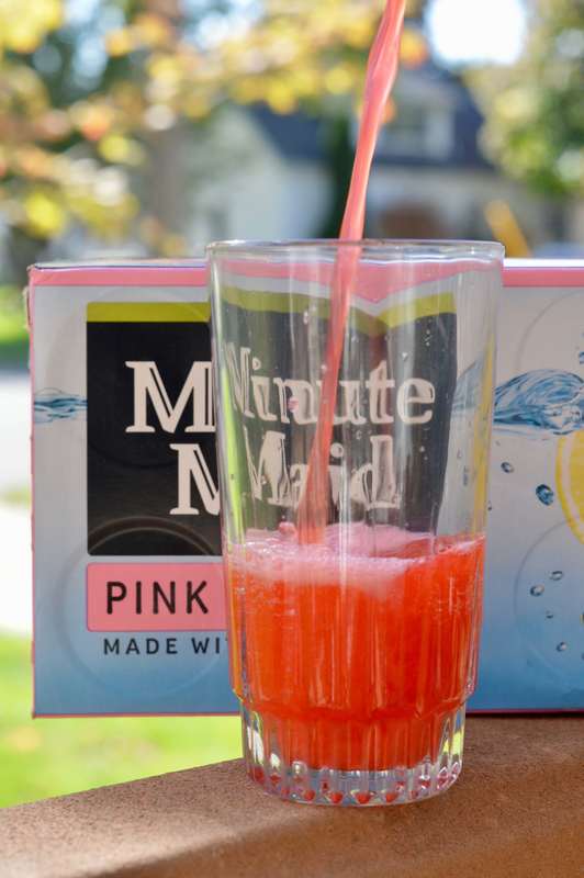
After looking at Darin's submission I nearly claimed that I forgot to take a picture this week or Kevin's dog ate my picture or something similar. But I will submit a photo after all. I decided to include a hint of Fall color in my photo. It suggests that after hours of raking leaves enjoy a tall, cool glass of pink stuff.
ISO 200, 50mm, f8, 1/100 sec.